12-Hour vs 24-Hour Digital Clock Display
A fullscreen clock looks simple, but one setting changes the whole feel of the room: the time format. A 12-hour display feels familiar to many people. A 24-hour display feels cleaner and less ambiguous in shared or task-focused spaces.
Neither format is always better. The better choice depends on who is reading the screen, how far away they are, and what the room needs. Some rooms need a calm background tool. Others need a precise reference point.
That is why a fullscreen digital clock page works best when users test the format in the actual room. This guide compares 12-hour and 24-hour display, then connects that choice to seconds, date, weekday, and shared-viewing setups.
Disclaimer: The information and assessments provided are for educational purposes only and should not replace professional medical advice, diagnosis, or treatment.
Why clock format changes how a room reads time
A clock does more than show the current minute. It sets the pace of the space around it. On a personal desk, the clock may be a quick glance tool. In a classroom or shared room, it may become the time reference everyone depends on.
That is why format matters. A display that feels natural to one person can feel slower to decode for another. Even a small choice, such as whether 15:00 or 3:00 PM appears on screen, changes how quickly people understand the time.
The site's live clock settings view makes this easy to test. Users can switch formats instantly and see which version feels clearer from their usual distance.
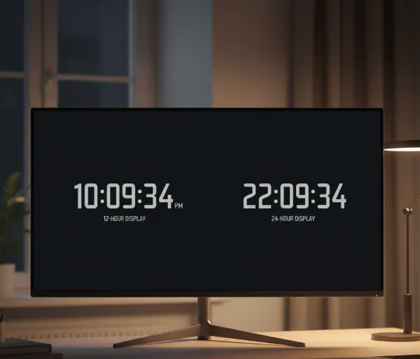
What 12-hour and 24-hour display each do well
Where 12-hour display feels more familiar
The 12-hour format works well when the audience already thinks in AM and PM. Homes, casual desk setups, and common room displays often feel more natural with that layout because it matches everyday speech.
The [NIST Time Widget] says it can display the official time of day from NIST as either a 12-hour or 24-hour clock in a user-selectable time zone. That is a useful reminder that the format choice is about readability preference, not about whether the underlying time source is more official.
For many users, 7:30 PM is simply easier to recognize than 19:30. That is especially true when the clock is serving as a background reference rather than a strict scheduling tool.
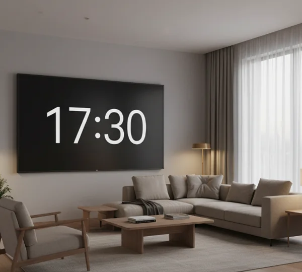
Where 24-hour display reduces ambiguity
The 24-hour format helps when ambiguity creates friction. It removes the need to mentally attach AM or PM, which is useful in work settings, shared rooms, or any environment where people read the clock quickly and move on.
That format also lines up well with official timekeeping language. [time]notes that UTC is always displayed as a 24-hour clock. That makes sense because 24-hour notation removes the half-day split and keeps time reference clean across broader systems.
In practice, a 24-hour display often feels strongest in classrooms, offices, or productivity spaces where the clock is more about clarity than familiarity. Once people are used to it, the reading becomes very fast.
How seconds, date, and weekday change the setup
When seconds help and when they distract
Seconds are useful when the room needs precision. That includes timing a presentation segment, watching a task handoff, or checking whether a device clock feels in sync with an official reference.
The site knowledge base already connects the clock to focus work and shared viewing. In those settings, seconds can be useful when the task depends on exact pacing. For general room use, though, they can add motion that the space does not need.
A quiet study room or home office may feel calmer with hours and minutes only. The choice depends on whether the extra precision helps the task or only adds visual noise.
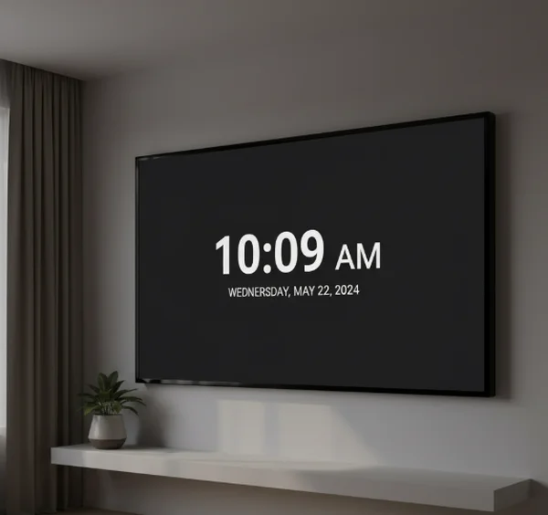
When date and weekday add useful context
Date and weekday settings help when the clock stays open for long stretches. A long-running desk screen, classroom display, or room clock often becomes more useful when it shows not just the time, but also where the day sits in the week.
[NIST's daylight-saving overview] says its time services broadcast UTC, while local time zone and daylight-saving corrections are handled by a computer's operating system. That is a good reminder that date and weekday context belong to the viewing setup, not just the raw time signal.
In other words, the extra information helps users stay oriented in real life. It is especially useful on Monday mornings, after breaks, or in rooms where several people rely on the same screen.
Which display fits desks, classrooms, and shared rooms
Personal desk and focus setups
A personal desk gives users more freedom to follow habit. If 12-hour time feels instant and natural, it is probably the better fit. If a person already works in 24-hour time, forcing a different format adds no value.
This is also where seconds become optional rather than necessary. Some people like the movement because it sharpens time awareness. Others find it distracting during reading, writing, or focused work. A digital clock format test is useful here because the answer is often personal.
Dark background mode, minimal extra information, and a stable format usually make the desk setup feel calmer. The more often the user glances at the clock, the more helpful simplicity becomes.
Public or shared viewing spaces
Shared rooms benefit from whichever format reduces confusion for the group. That often means choosing the notation that the audience reads fastest from across the room, then limiting other settings that compete for attention.
In classrooms or meeting spaces, 24-hour display can feel clean because it removes AM or PM ambiguity. In family rooms or casual areas, 12-hour time may still win because it matches how people speak about the day. The best answer is the one that takes the least mental work for most viewers.
This is also where date and weekday settings often earn their place. A shared screen usually does more than show minutes passing. It also helps people orient themselves inside the day.
Next steps for choosing the cleaner clock view
A 12-hour display usually feels more familiar. A 24-hour display usually feels more explicit. Seconds help when precision matters. Date and weekday help when the screen stays visible long enough to guide the day.
That is why the online clock settings screen is most useful when users test each choice in the real room instead of guessing from the menu alone. A good fullscreen clock is not the one with the most information. It is the one that gives the room the right amount of time context, in the fastest possible glance.
If time-related stress, sleep disruption, or anxiety around schedules becomes severe or persistent, seek professional help from a qualified healthcare provider instead of relying on online information alone.